If you’re interested in creating your own desktop application for macOS, you’ll be delighted to discover how simple it can be with the help of Xcode and Swift.
Apple has developed SwiftUI, a specialized toolkit that assists developers in crafting the visual aspects of applications for iPhones, Mac computers, Apple Watches, and Apple TVs.
SwiftUI presents a modern approach to constructing user interfaces, which encompass the screens and buttons users interact with while using an application. Xcode, a complimentary tool provided by Apple, enables you to build apps utilizing SwiftUI.
In this article we will use SwiftUI and Xcode to create a macOS app with its own GUI. We will use imported assets, such as our own pictures and sounds, to create the GUI.
This article serves as the third installment in the comprehensive beginner series for Xcode and Swift. If you’re interested in learning how to develop a macOS app from start to finish, you may want to consider starting from part 1.
Complete Beginners Guide: Swift & Xcode
- Part 1 – How to Make a macOS Desktop App: Beginners Start Here
- Part 2 – Beginners Guide to Adding Images, Sounds and Icons to Xcode
- Part 3 – An Easy Beginners Guide to Making a macOS GUI using Swift
- Part 4 – How to Add Audio to your macOS App Using Swift
- Part 5 – Beginners Guide to Xcode & Swift: Completing the App
Prerequisite
This article will be continuing on from the previous parts in the series and therefore assumes that you have installed Xcode, prepared a new project and imported the necessary assets.
If you already have Xcode installed and know how to create new projects, you can get up to speed by creating a new project and adding the necessary assets as described here.
If you are new to Xcode then I would recommend starting from part 1 of this tutorial series.
Note that this tutorial series was written using Xcode 14 and the sample app requires macOS 11.0 or newer.
Getting Familiar with SwiftUI and Xcode
When creating a new SwiftUI Xcode project you will notice that Xcode automatically adds two Swift files to the project tree. You can find these files in the Navigator.
Each Swift file in the project can be identified by the Swift logo next to the file name. The two files created by default are as follows:
- Finger_DrumsApp – The
<my-project-name>Appfile in Xcode SwiftUI projects is like the main hub of your application. It’s the first file that gets executed when you run your app. - ContentView – The ContentView file in Xcode SwiftUI projects is where you define the visual layout and content of a specific view within your application. It represents what users see and interact with on the screen.
You can view either of these files by double-clicking them, which also opens a new tab at the top of the central display. You can easily switch between which file you are editing by clicking the tabs.
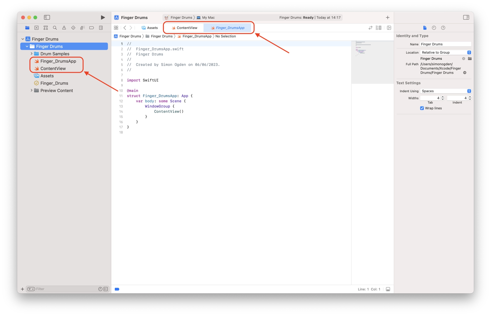
Each of the files created starts out populated with some placeholder Swift code. We can take a closer look at each file:
Finger_DrumsApp.swift
The main application file is usually named after your project. From here we will refer to this file as Finger_DrumsApp as this is the name of our sample project. Let’s take a look at the code:
// Finger_DrumsApp.swift
// Finger Drums
//
// Created by Simon Ogden on 06/06/2023.

import SwiftUI

@main
struct Finger_DrumsApp: App {
    var body: some Scene {
        WindowGroup {
            ContentView()
        }
    }
}
You will notice that the first 4 lines of code begin with a double forward slash //. This denotes a comment in the code and will be ignored by the compiler.
// Finger_DrumsApp.swift
// Finger Drums
//
// Created by Simon Ogden on 06/06/2023.
The purpose of comments is to allow a method of adding notes to the code so that human readers can better understand what each section of code does.
In this example, comments are used at the beginning of the file to describe the purpose of the file. Other details are often included, such as the code revision and author name in order to better aid version control.
import SwiftUI
This next line imports the SwiftUI framework, which contains the necessary tools and components for building the user interface of the app.
The SwiftUI framework is itself a collection of code that performs useful tasks. When we import modules in this way, it allows us to use the code in the module.
For SwiftUI projects we always want to import the SwiftUI module and it is usually the first line of code we need to add to the files in our project.
@main
The @main attribute is used to mark the Finger_DrumsApp as the main starting point of the application. Think of it as a special label that tells the app where to begin running.
The Finger_DrumsApp is like a blueprint or a plan that defines how the app should work. It follows the rules specified by the App protocol, which is like a set of guidelines for building apps.
By conforming to this protocol, the Finger_DrumsApp is able to perform the necessary tasks and functions expected of an app.
struct Finger_DrumsApp: App {In the line struct Finger_DrumsApp: App {, the term “struct” refers to a fundamental building block in programming that allows you to define your own custom data structure.
Think of a struct as a container that holds related pieces of information, or in this case, defines the characteristics and behavior of the Finger_DrumsApp. It’s like a blueprint or template that describes what the Finger_DrumsApp is made of and how it should function.
By declaring struct Finger_DrumsApp, we create a new struct called Finger_DrumsApp. This struct defines the main structure or skeleton of our application. It specifies the properties (data) and behaviors (methods) that our app will have.
The : App part indicates that the Finger_DrumsApp struct conforms to the App protocol. A protocol is a set of rules or requirements that a struct (or a class) can adopt to provide specific functionality.
In this case, by conforming to the App protocol, the Finger_DrumsApp struct gains the ability to serve as the main entry point of the application and fulfill the necessary tasks expected of an app.
var body: some Scene {In the code var body: some Scene { }, the term “property” refers to a variable that holds a value. In this case, the body is a special kind of variable called a computed property. It represents the main content or the root view of our app.
Think of the body property as a placeholder or container where we can put the user interface elements, such as buttons, text, images, and more, that make up our app. It’s like the canvas or the foundation of our app’s visual design.
The some Scene part tells us the type of value that the body property holds. In SwiftUI, a “Scene” is a concept that represents a part of the app’s user interface. It could be a screen, a window, or a specific view within the app. By using some Scene, we allow flexibility for the body property to hold different types of scenes, depending on our app’s needs.
To provide the content for the body property, we define what should be displayed as the main content or view of our app within the curly braces { }. We can create and customize our own views or use existing SwiftUI views to build the user interface.
WindowGroup {
	ContentView()
}
In this code, we have a special structure called WindowGroup that is created within the body property. Think of a WindowGroup as a container that represents a window in our app. It’s like a frame where we can display our app’s content and functionality.
Inside the WindowGroup, we define what should be shown inside the window using curly braces { }. We can add different elements like buttons, text, images, and more to create our app’s user interface.
In this case, the ContentView view is instantiated by using ContentView(). This means that we are creating an instance or a copy of the ContentView view, which serves as the initial content or the first thing we see when we open our app.
The ContentView view is where we can design and customize the visual layout and components of our app. It’s like a canvas where we can arrange and style the various elements to create the desired look and feel.
By setting the ContentView as the content within the WindowGroup, we ensure that it is displayed as the main view in our app’s window when the app is launched.
We could include elements that we wish to display directly within WindowGroup, however we can better organize the code by including this in a different file.
In this case the main body of ContentView is contained within the ContentView Swift file.
ContentView.swift
Next, we can take a closer look at the ContentView.swift file, which is called from the WindowGroup section of the Finger_DrumsApp.swift file:
//
//  ContentView.swift
//  Finger Drums
//
//  Created by Simon Ogden on 06/06/2023.
//

import SwiftUI

struct ContentView: View {
    var body: some View {
        VStack {
            Image(systemName: "globe")
                .imageScale(.large)
                .foregroundColor(.accentColor)
            Text("Hello, world!")
        }
        .padding()
    }
}

struct ContentView_Previews: PreviewProvider {
    static var previews: some View {
        ContentView()
    }
}
Like with the Finger_DrumsApp file, we begin with a comment section that provides information about the file, including its name, the name of the app (“Finger Drums”), and the date of creation.
import SwiftUI
Just like in the Finger_DrumsApp file, the first thing to do is import the SwiftUI framework, which provides the necessary tools and components for building the user interface of the app.
struct ContentView: View {Here, we define a new structure called ContentView. Think of a structure as a way to group related pieces of code together. The ContentView structure is specifically designed to represent and manage the user interface of our app.
var body: some View {The body property is a computed property that defines the content or the view hierarchy of the ContentView. It’s like a container where we define what should be displayed on the screen.
VStack {
    Image(systemName: "globe")
        .imageScale(.large)
        .foregroundColor(.accentColor)
    Text("Hello, world!")
}
.padding()
Inside the body property, we create a vertical stack (VStack) that allows us to stack multiple views vertically. In this case, we have two views inside the VStack:
- An
Imageview that displays a system image named “globe”. We use thesystemNameparameter to specify the name of the system image. We customize the image by setting its scale to.largeand its color to the accent color of the app. - A
Textview that displays the text “Hello, world!”.
The .padding() modifier is applied to the entire VStack to add some spacing around its content.
struct ContentView_Previews: PreviewProvider {
    static var previews: some View {
        ContentView()
    }
}
These lines define a separate structure called ContentView_Previews that conforms to the PreviewProvider protocol.
This structure is used for providing a preview of the ContentView during the development process. It allows us to see how the view looks in Xcode’s preview canvas. In the previews property, we create an instance of ContentView and return it as the preview.
Running A SwiftUI Project in Xcode
The code provided in the two default Swift files provide us with a basic “hello world” app example. We can jump right in and execute this code to see how it performs:
In order to run our application, we need to build it first. It is very easy to do, all we need to do is click the play button at the top of the screen and Xcode will build and execute our application:
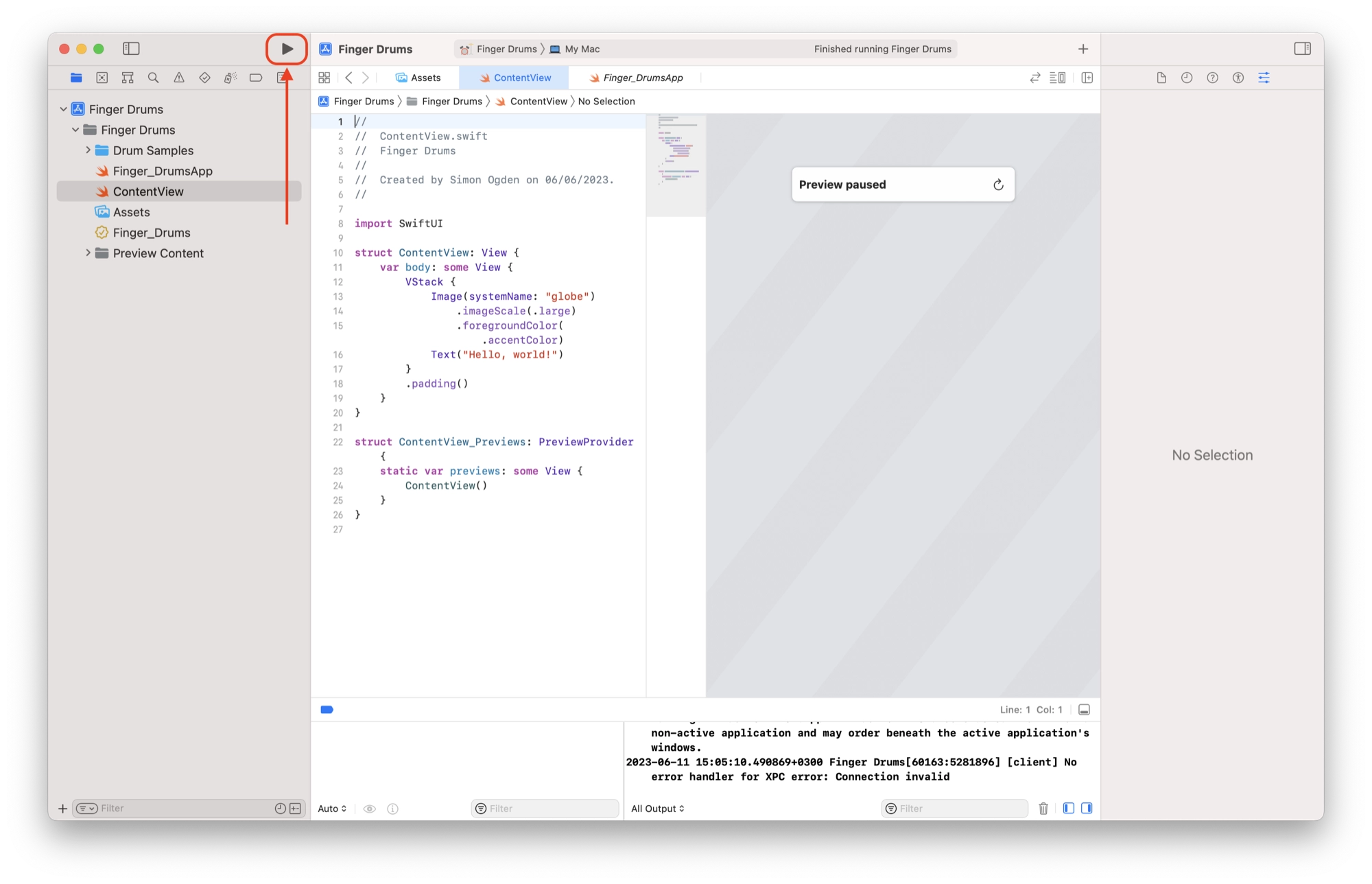
Once the project has finished building, the app will be launched and we can see what our Swift code is doing.
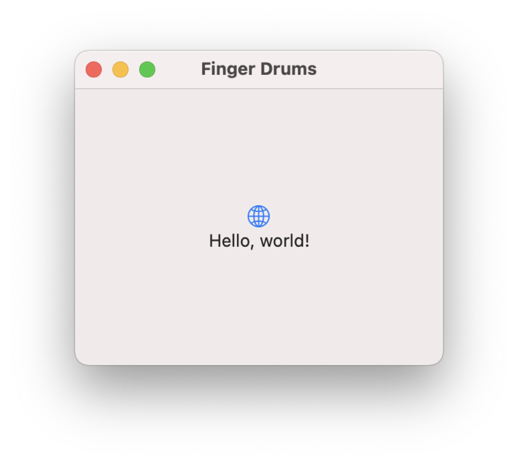
As you can see, we have our main application window containing the aforementioned globe image and “hello world” text.
Building a macOS GUI with SwiftUI
Now that we have an understanding of the two main files in our Swift project, we can start to design and build our own user interface that we will use for our application.
We will be using the assets already loaded into the project, so if you haven’t added them yet you can see how to do that in this section of the previous part.
How To Use HStack and VStack in Swift
In order to build our own GUI for the sample application, we will first modify the ContentView file so that it reads as follows:
//
//  ContentView.swift
//  Finger Drums
//
//  Created by Simon Ogden on 06/06/2023.
//

import SwiftUI

struct ContentView: View {
    var body: some View {
        // The main GUI space
        HStack {
            VStack {
                // Row 1 GUI elemenets
            }
            VStack {
                // Row 2 GUI elemenets
            }
            VStack {
                // Row 3 GUI elemenets
            }
        }
    }
}


struct ContentView_Previews: PreviewProvider {
    static var previews: some View {
        ContentView()
    }
}
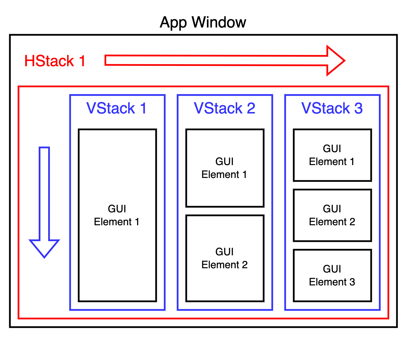
In the code above the “hello world” GUI elements have now been replaced with HStack and VStack placeholders. These commands are used to create rows and columns where we can place the graphical elements we wish to include in our app.
In the example we first create a HStack, which makes a horizontal row in the app window. The subsequent VStack commands are placed within the curly braces {} and therefore are placed inside of the HStack.
Consider the following sample code:
HStack {
	VStack {
		// GUI Element 1
	}
	VStack {
		// GUI Element 1
        // GUI Element 2
	}
	VStack {
		// GUI Element 1
        // GUI Element 2
        // GUI Element 3
	}
}
The following diagram illustrates the app window created by the code:
Creating a Function to Render Buttons
Now that we have a placeholder for positioning our GUI elements, we can begin adding the actual elements that we want in our app.
The first thing we need to do is create a new function that will render the button. In order to do this, add the following code beneath the HStack container.
func createButton(imageName: String) -> some View {
        return Button(action: {}) {
            Image(imageName)
                .resizable()
                .aspectRatio(contentMode: .fit)
        }
    }
The code should be placed within the ContentView struct, shown below in line 26 to line 32:
//
//  ContentView.swift
//  Finger Drums
//
//  Created by Simon Ogden on 06/06/2023.
//

import SwiftUI

struct ContentView: View {
    var body: some View {
        // The main GUI space
        HStack {
            VStack {
                // Row 1 GUI elemenets
            }
            VStack {
                // Row 2 GUI elemenets
            }
            VStack {
                // Row 3 GUI elemenets
            }
        }
    }

    func createButton(imageName: String) -> some View {
        return Button(action: {}) {
            Image(imageName)
                .resizable()
                .aspectRatio(contentMode: .fit)
        }
    }
}


struct ContentView_Previews: PreviewProvider {
    static var previews: some View {
        ContentView()
    }
}
Let’s take a closer look at this code and what it actually does:
func createButton(imageName: String) -> some View {This line declares a function named createButton that takes a piece of information called imageName. It also specifies that the function will return something that can be shown on the screen (a view).
return Button(action: {}) {This line creates a button that can be pressed on the screen. It doesn’t have any specific action attached to it (represented by {}), so it won’t do anything when pressed. The button will contain some other things that will be defined next.
Image(imageName)
    .resizable()
    .aspectRatio(contentMode: .fit)
This part represents an image that will be displayed inside the button. The Image(imageName) line specifies the name of the image to be shown, which is taken from the imageName provided to the function. The resizable() part allows the image to be scaled to fit different sizes, and the aspectRatio(contentMode: .fit) part ensures that the image is shown with its original proportions.
	}
}
The two braces at the end of the function close the content of the button and the createButton function itself.
The completed createButton function is used to create a button that shows an image. It takes the name of the image as input and returns the button with the specified image.
At this stage the button itself doesn’t perform any specific action when pressed, we will add the button functionality later.
Adding Buttons to the GUI
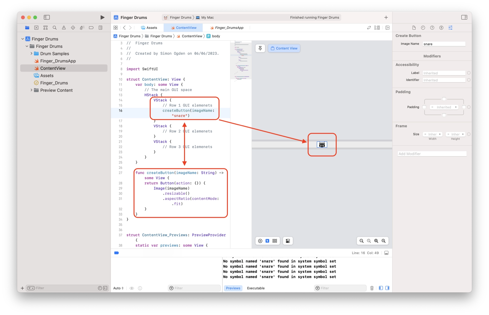
Now that we have added a function to our app that can create buttons, we can use it to actually create buttons in the GUI. We can do this by calling the createButton function anywhere that we want to create a button:
createButton(imageName: "snare")
Here we call the createButton function and pass the name of the image that we want to display within the button. The function is written in a way that the imageName is fetched from the assets library.
We can add this function call directly into the VStack container in order to place the button in our application window:
struct ContentView: View {
    var body: some View {
        // The main GUI space
        HStack {
            VStack {
                // Row 1 GUI elemenets
            	createButton(imageName: "snare")
            }
            VStack {
                // Row 2 GUI elemenets
            }
            VStack {
                // Row 3 GUI elemenets
            }
        }
    }
Once you have added the createButton function call to the code, you should see the button rendered in the preview window:
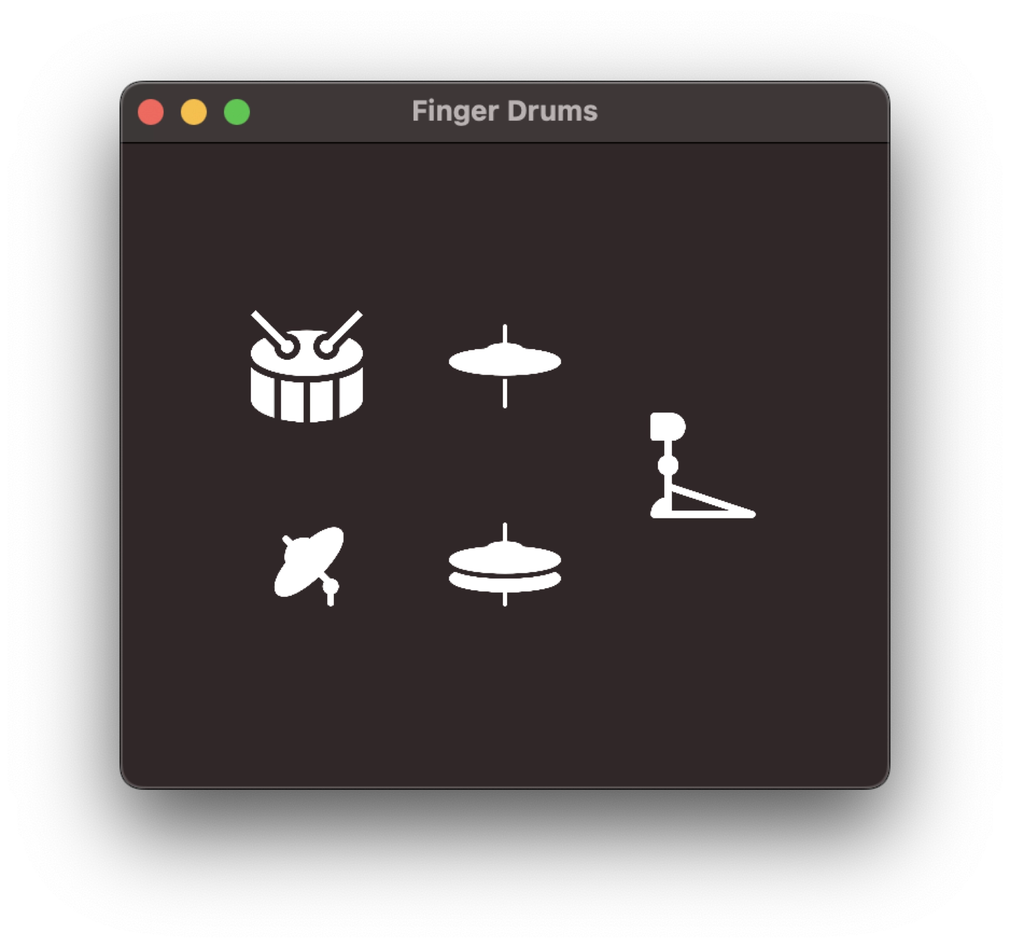
Now let’s go ahead and add the other buttons to our app GUI. We will achieve this by adding more calls to the createButton function:
struct ContentView: View {
    var body: some View {
        // The main GUI space
        HStack {
            VStack {
                // Row 1 GUI elemenets
                createButton(imageName: "snare")
                createButton(imageName: "crash")
            }
            VStack {
                // Row 2 GUI elemenets
                createButton(imageName: "closed-hi-hat")
                createButton(imageName: "open-hi-hat")
            }
            VStack {
                // Row 3 GUI elemenets
                createButton(imageName: "kick")
            }
        }
    }
Once you have added the additional buttons to the VStack containers, you will see the buttons added to the GUI:
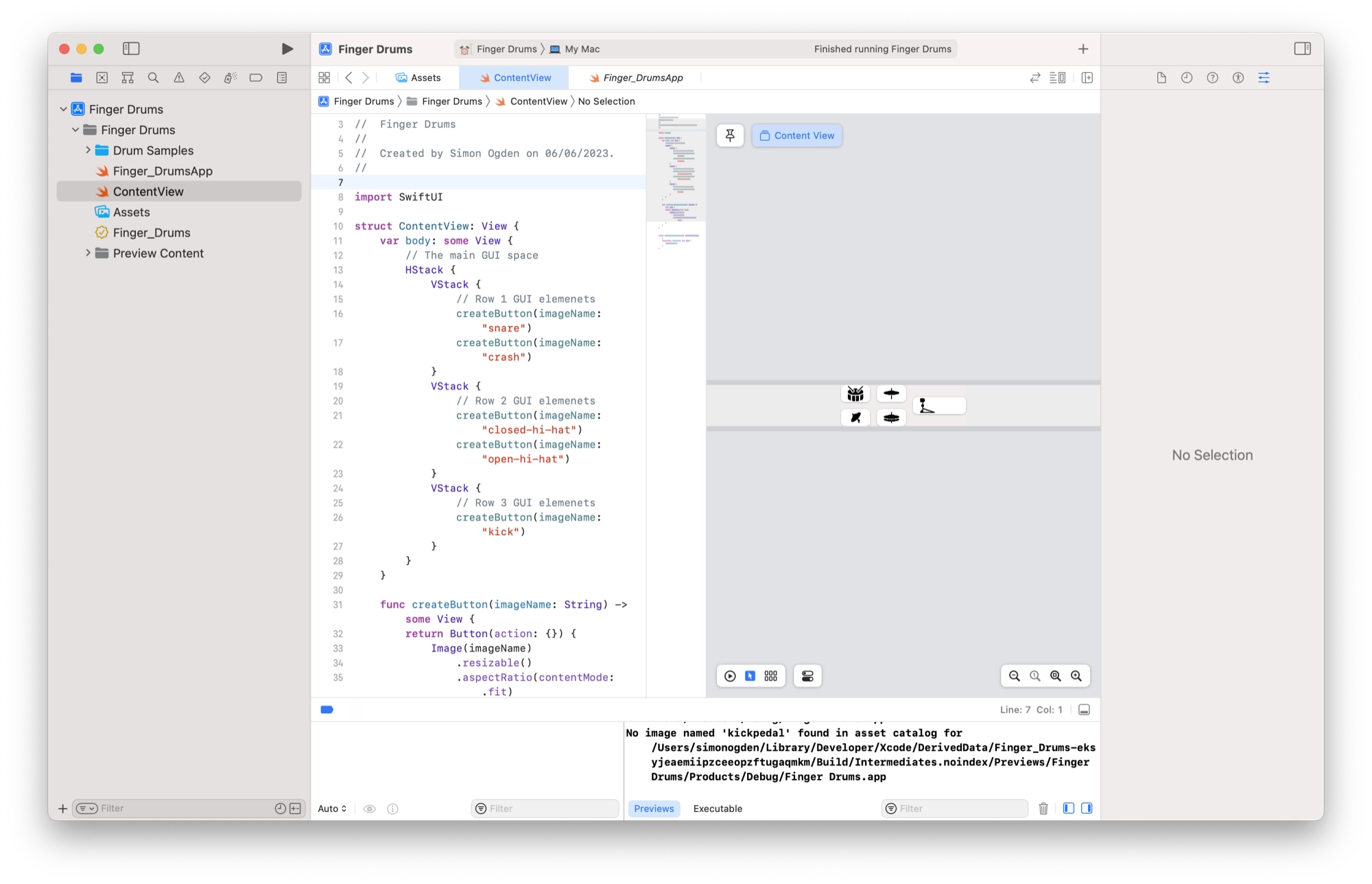
Adding and Changing Swift Modifiers
Now we have a rough layout for our GUI but it does not quite right yet. We change change the way that elements appear in the GUI using modifiers.
In SwiftUI, a modifier is a special instruction or setting that you can apply to a view to change its appearance or behavior. Think of modifiers as a way to add or adjust specific characteristics of a view.
For example, let’s say you have a text view that displays a message. You can use modifiers to change the font size, color, or alignment of the text. You can also apply modifiers to add padding around the text, make it bold, or add a background color.
Modifiers are chained together using dot notation, like .modifier1().modifier2().modifier3(). This allows you to apply multiple modifiers to a view in a sequence.
We can also place the modifiers on new line for better readability, and SwiftUI will still interpret them as a chain, for example:
Image(imageName)
	.modifier1()
    .modifier2()
    .modifier3()
Modifiers are versatile and allow you to customize and fine-tune your views according to your needs. They help you control aspects such as layout, styling, interactivity, and more.
By combining and applying different modifiers, you can create unique and visually appealing user interfaces.
There are two ways that we can add modifiers to the elements in our application. They can be manually typed directly into the code, however they can also be added using the Inspector.
In this example we will add a modifier to the Button element found in the createButton function.
First, click the Button element so that the cursor is sitting inside the text. This will bring up the modifier options in the Inspector.
Next, check all of the checkboxes found in the padding section. This will add padding around the buttons. Note that the Inspector automatically adds the .padding(.all) modifier to the code.
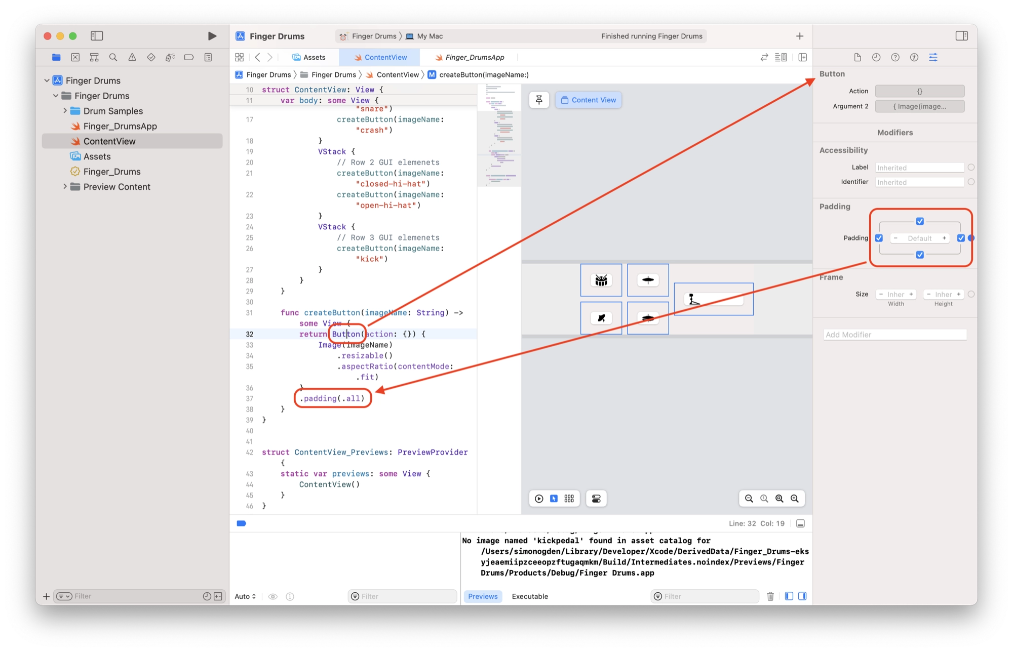
You can of course add the modifier code by hand, simply by typing it out in the code. However the Inspector provides an easy and convenient way to do this without having to remember all of the available modifiers.
Let’s add the .buttonStyle modifier by hand in order to change the style of the button. The function should now look like this:
func createButton(imageName: String) -> some View {
return Button(action: {}) {
Image(imageName)
.resizable()
.aspectRatio(contentMode: .fit)
}
.buttonStyle(.plain)
.padding(.all)
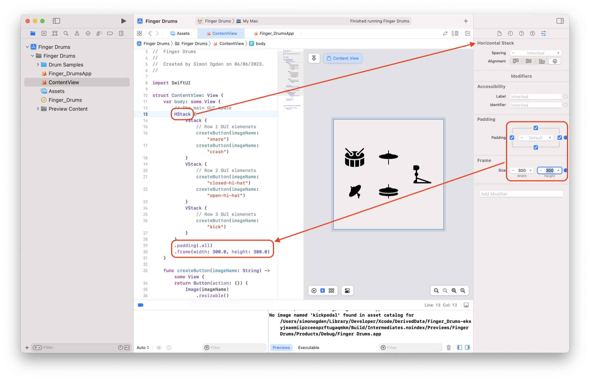
}Lastly we will modifiers to the main HStack container in order to improve the aesthetics of our GUI. Click the HStack command in the code editor to move the cursor and switch the Inspector view to the HStack modifiers.
Add padding around the HStack as you did with each of the buttons and set the frame size to 300 x 300:
Adding Dark Theme Support
If you are using dark mode by default you may have already noticed a small problem with our GUI. As our icon images are black, they don’t really show up properly when switching to dark mode.
In order to make our application look good in both dark and light mode we can simply invert the color of the button images from black to white when dark mode is enabled.
We can invert the color of the buttons by adding the .colorInvert() modifier, shown here on line 42:
func createButton(imageName: String) -> some View {
        return Button(action: {}) {
            Image(imageName)
                .resizable()
                .aspectRatio(contentMode: .fit)
        }
        .buttonStyle(.plain)
        .padding(.all)
        .colorInvert()
    }
When adding this modifier to Button within the createButton function, you will see the color of the button images invert.
However this modifier is static and it won’t change depending on the theme. What we need to do is create our own modifier whose value changes depending on the theme.
To define the behavior of the modifier we can create a new function within an extension of the view protocol. As this is an extension of view, it must be placed underneath the ContentView struct.
extension View {
    func applyColorInvert(_ colorScheme: ColorScheme) -> some View {
        if colorScheme == .dark {
            return AnyView(self.colorInvert())
        } else {
            return AnyView(self)
        }
    }
}
Now we can replace .colorInvert() with our custom modifier:
func createButton(imageName: String) -> some View {
        return Button(action: {}) {
            Image(imageName)
                .resizable()
                .aspectRatio(contentMode: .fit)
        }
        .buttonStyle(.plain)
        .padding(.all)
        .applyColorInvert(colorScheme)

    }
The .applyColorInvert(colorScheme) modifier passes the value colorScheme to the applyColorInvert, which tells the function whether or not dark mode is active.
The function then returns and applies .colorInvert() if the theme is currently set to dark mode.
However in order for it to function correctly, we need to get a value for colorScheme from somewhere to actually pass to our function. We can fetch this value using the @environment property.
Add the following line to ContentView. You can place it just inside of the ContentView struct:
struct ContentView: View {
    @Environment(\.colorScheme) var colorScheme
In SwiftUI, @Environment is a property wrapper that allows you to access values from the environment. The environment represents the current configuration or state of the app.
In this case, @Environment(\.colorScheme) is used to access the color scheme of the app. The colorScheme property is declared as a variable (var) using the var keyword.
The backslash (\) followed by .colorScheme is a key path that specifies the specific value we want to access from the environment. It refers to the color scheme of the app, which can be either .light or .dark, representing light mode or dark mode, respectively.
By using the @Environment(\.colorScheme) var colorScheme declaration, you can access the current color scheme of the app within the ContentView or any other SwiftUI view where it is used.
This allows you to dynamically adjust the appearance or behavior of your views based on the app’s color scheme. With these changes in place, the final code is as follows:
//
//  ContentView.swift
//  Finger Drums
//
//  Created by Simon Ogden on 06/06/2023.
//

import SwiftUI

struct ContentView: View {
    @Environment(\.colorScheme) var colorScheme
    var body: some View {
        // The main GUI space
        HStack {
            VStack {
                // Row 1 GUI elemenets
                createButton(imageName: "snare")
                createButton(imageName: "crash")
            }
            VStack {
                // Row 2 GUI elemenets
                createButton(imageName: "closed-hi-hat")
                createButton(imageName: "open-hi-hat")
            }
            VStack {
                // Row 3 GUI elemenets
                createButton(imageName: "kick")
            }
        }
        .padding(.all)
        .frame(width: 300.0, height: 300.0)
    }

    func createButton(imageName: String) -> some View {
        return Button(action: {}) {
            Image(imageName)
                .resizable()
                .aspectRatio(contentMode: .fit)
        }
        .buttonStyle(.plain)
        .padding(.all)
        .applyColorInvert(colorScheme)

    }

}

extension View {
    func applyColorInvert(_ colorScheme: ColorScheme) -> some View {
        if colorScheme == .dark {
            return AnyView(self.colorInvert())
        } else {
            return AnyView(self)
        }
    }
}

struct ContentView_Previews: PreviewProvider {
    static var previews: some View {
        ContentView()
    }
}
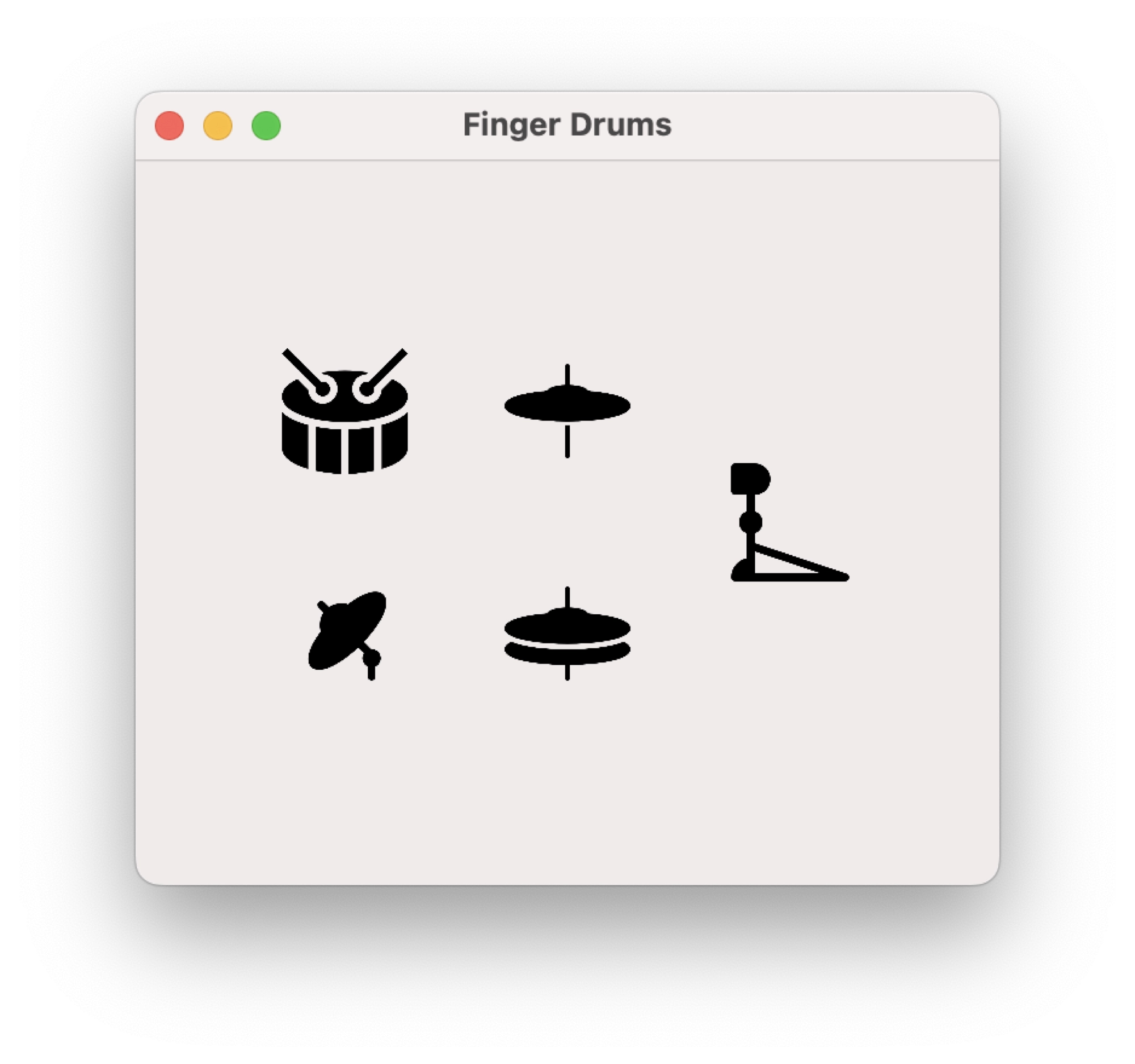
Now we can test our new app GUI. You should see the app changes nicely between dark and light mode. Note that there is a useful utility App called NightFall that you can use for easy testing: https://github.com/r-thomson/Nightfall
Creating App Functionality
In this article we have covered the fundamentals of SwiftUI and have build the graphical elements of our sample application.
We have learned how to leverage HStack and VStack containers to organize our GUI elements and then further customize the design using modifiers.
The next step is to actually add the functionality to the app. For our sample app we will build a simple audio player that can trigger bundled sounds when the buttons are pressed.
In part 4 of this tutorial we will build a simple sound player and learn how to access files within the project bundle.
Thanks so much for visiting my site! If this article helped you achieve your goal and you want to say thanks, you can now support my work by buying me a coffee. I promise I won't spend it on beer instead... 😏